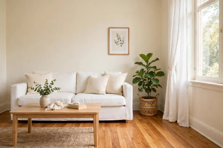
The Complete Small Room Color Guide: Paint, Combinations, Ceilings and Finishes for Tiny Spaces
This small room color guide pulls every color decision for a tiny home into one place. It covers paint picks, color combinations, ceiling colors, finishes, and the light test that should come before any of them.
Here is the original math behind this guide. Take a standard bedroom, 10 feet by 12 feet (305 cm by 366 cm), with 8 foot (244 cm) ceilings. The four walls measure 352 sq ft (32.7 sq m) before deductions. Subtract one door at 21 sq ft and one window at 15 sq ft, and you get 316 sq ft (29.4 sq m) of paintable wall. Most interior wall paints cover about 350 to 400 sq ft per gallon per coat, so one coat needs about one gallon, and two coats need two gallons. Buy the second gallon. Running out mid-wall is how patchy rooms happen.
How to use this small room color guide
Start with the light section, not with a paint chip. Light decides how a color behaves, and a color that looks calm in a store can look cold or yellow on your wall. Once you know your light direction and your fixed finishes, the hub map below points you to the detailed post for each decision. Use this guide as the map, and use the linked posts as the deep dives.
The honest opinion up front: most small room color advice is too narrow. It tells you to paint everything white and stops there. White helps, but white alone does not fix a north facing room, a low ceiling, or a floor that fights your walls. A small room needs a system, not a single shade.
Start with light, not with a paint chip
Do a one day light audit before you buy anything. Look at the room in the morning, at midday, and in the evening. Note whether it gets direct sun or soft ambient light, and whether lamps do most of the work after dark. That audit matters more than any trend list, because the same paint can read as three different colors across one day.
North facing rooms get cool, indirect light all day, so cool grays can turn icy there. Warm whites and warm neutrals balance that light instead of fighting it. South facing rooms get warm, golden light, so a cooler or more neutral shade keeps them from feeling overheated. East rooms are warm in the morning and cooler in the afternoon, and west rooms are the reverse, so both need a balanced shade checked at both times of day.
Light Reflectance Value, or LRV, is the number to check on a paint chip. It measures how much light a color reflects, on a scale from 0 to 100. Sherwin-Williams notes that light colors with an LRV above 65 make a space feel expansive, and that ceiling and trim choices matter just as much as the wall color itself. You can read their full guide on how to make a room look bigger. For a dark room, I would pick from the high LRV end first, then warm or cool it to suit the light direction.
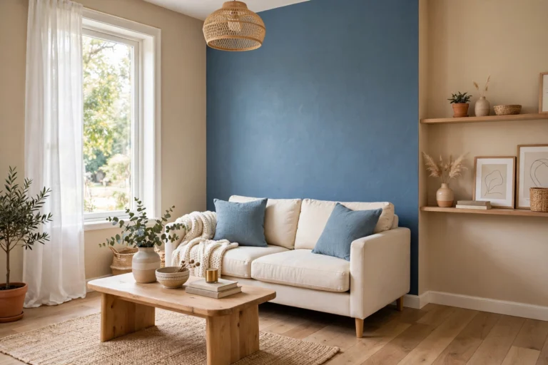
Sample the right way. Paint two large swatches, at least 2 feet by 2 feet (61 cm by 61 cm), on two different walls. Look at them in morning, afternoon, and lamplight, and judge by the worst light, not the best. A shade that survives your worst light will look good everywhere else. Benjamin Moore makes the same point in its guide to colors that make rooms look bigger and brighter: lighter, airy shades and pale blues recede and open a space, while a single bold accent wall adds depth without closing the room in.
The hub map: every color post on this site, grouped
This section is the map. Each link below goes to a full post on this site, so you never have to re-learn a topic from scratch here.
Start with the foundation. Our best wall colors for small rooms post is the first pick list, and it pairs with our guide to warm vs cool paint colors for small rooms when you cannot decide which temperature suits your light. If your room faces north, go straight to our paint colors for north facing rooms instead, because that post is built around cold, gray light. For a bolder room, our bold paint colors for small rooms post shows where strong color works and where it swallows a room.
For combinations, the series is complete. Our 3 color combination for room post gives twelve ready palettes in the 75 percent light, 25 percent bold split this site recommends. Pair walls with curtains using our curtain and wall color combinations, pair walls with furniture using our furniture and wall color combinations, and pair floors with walls using our floor and wall color combinations. In the kitchen, our cabinet and countertop color combinations and our kitchen cabinet colors posts cover the two surfaces that set the whole room. Doors get their own post too, in our best door colors for small homes.
For ceilings, read the design post before the color post. Our ceiling designs for small rooms post covers tray, coffered, and beadboard options, and our false ceiling designs for small rooms post covers gypsum and POP false ceilings for living rooms and bedrooms. Then pick the shade in our ceiling colors for small rooms post, which is the one that makes low ceilings look taller.
For surfaces and trends, two posts finish the map. Our best tile colors for small bathrooms post handles the room where tile, not paint, sets the palette. Our best paint finish for small rooms post settles matte versus eggshell versus satin, room by room. For trend years, our 2026 colors of the year for small rooms post is now the archive, and our 2027 colors of the year for small rooms post is the current roundup, so start with 2027 and only dip into 2026 for ideas that still suit your light.
Pick a palette in four steps
Step one is to name your fixed finishes. Floors, tile, countertops, and big furniture pieces are not changing, so they vote first. Warm honey oak, beige tile, and brass point warmer. Gray floors, white marble, chrome, and blue tile point cooler. If warm cabinets and cool flooring clash, a restrained greige tested against both usually bridges them.
Step two is to pick one light dominant color for about 75 percent of the room. This is your wall color, and in a small room it should be light, low contrast against the trim, and matched to your light direction. Step three is to pick one bold accent for about 25 percent of the room. That accent goes on one wall, or one big element like a sofa or a headboard wall, never on all four walls. One light dominant plus one bold accent, sharing an undertone, is the rule this site uses in every color post, and it keeps a small room designed instead of busy.
Step four is to repeat, not reinvent. A whole home works best on three to five wall colors in total, with separate colors for trim and ceilings. Repeat a supporting color where rooms share a sightline, so a hallway, a living room, and a kitchen read as one home instead of three paint experiments. If you can see two rooms at once, their colors should be related, not competing.
Ceilings and trim: the parts most guides skip
Ceilings decide height, and trim decides contrast, yet most color guides barely mention either. Paint the ceiling a shade lighter than the walls and the eye travels up, which helps a low ceiling. Paint the ceiling the same color as the walls and the hard cut line disappears, which can make a small bedroom or office feel calmer and more continuous. Both work. What fails is a bright white ceiling over warm walls with no plan, because the contrast draws a line around the whole room.
Trim follows the same logic. Low contrast trim, only slightly lighter than the walls, lets the eye glide and makes a room feel larger. High contrast bright white trim around a mid tone wall gives definition and a tailored look, which suits a tiny office or living room where you want crisp edges. Color drenching, where walls, trim, and sometimes the door share one color, removes visual breaks entirely and suits a cozy bedroom or powder room. Pick one approach per room and stick to it. Mixed trim approaches in one small room just look accidental.
One more ceiling rule from this site’s own posts: a bold ceiling color belongs in a room with enough height or enough light to carry it. In a low, dark room, keep the ceiling light and put the bold color on one wall instead. That is why this small room color guide sends ceiling color after ceiling design, not before it.
Finishes: where each one belongs
Finish changes how a color reads, and it changes how a wall survives. Matte hides imperfections and glare, so it suits bedrooms and living rooms with rough walls or strong side light. Eggshell adds a soft sheen and wipes cleaner, so it suits hallways, living rooms, and bedrooms that get daily traffic. Satin and semi gloss bounce more light, which can help a dark room, but they also highlight every bump, so they belong on trim, doors, and cabinets, not on a flawed wall.
Bathrooms and kitchens need the washable end of the range, because steam, splashes, and cooking grease are not kind to flat paint. That is a practical choice, not a style choice, and our finish post maps it room by room. If you remember one rule, make it this: the rougher the wall, the flatter the finish, and the wetter the room, the more washable the finish.
What to skip
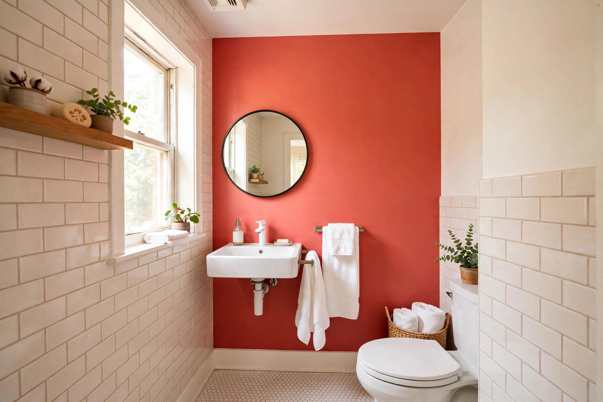
Skip a new paint color for every room. Ten unrelated shades in a small home chop it into pieces, and no single room looks better for it. Skip icy gray in a north facing room unless you have warm lamps and warm textiles to balance it, because cold light plus a cold gray reads as a cold room. Skip a dark color on all four walls of a small, low light room, even if you love the shade on a paint chip, because four dark walls close a room in while one dark accent wall adds depth.
Skip buying paint before sampling on two walls, and skip sampling on a tiny card held against the wall. A card is too small to judge, and a wall is what you actually live with. Skip matching your wall to your sofa instead of to your light and your fixed finishes, because sofas move and floors do not. And skip repainting a ceiling bright white by habit. Ask first whether a lighter shade of the wall color, or the wall color itself, would serve the room better.
Four palette families, judged honestly
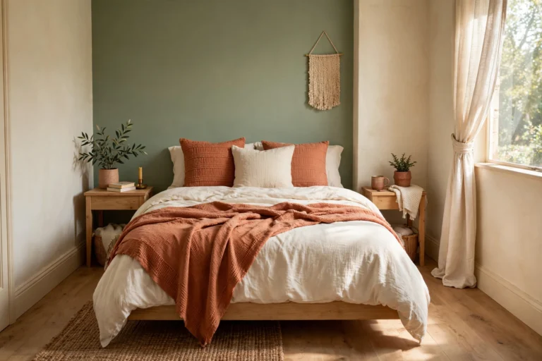
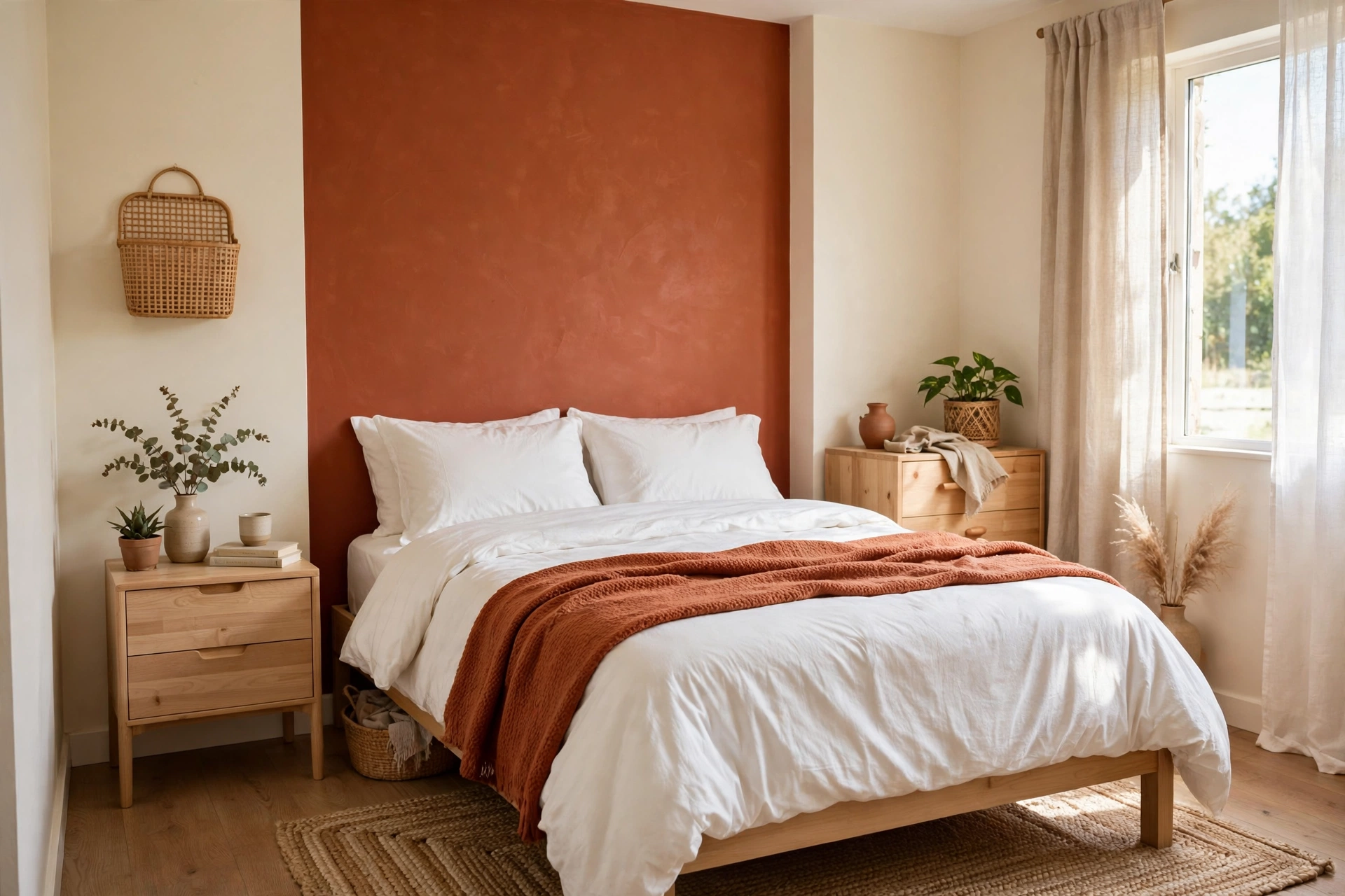
Warm ivory plus terracotta. Best for north facing rooms, bedrooms, and living rooms that need warmth. Main advantage: it fights cold light without going dark. Watch out for: terracotta turning orange under very warm lamps, so test it at night too. Verdict: the safest warm palette on this site, and the one I would pick first for a dim room.
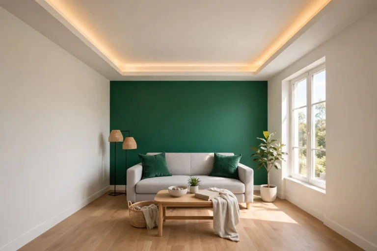
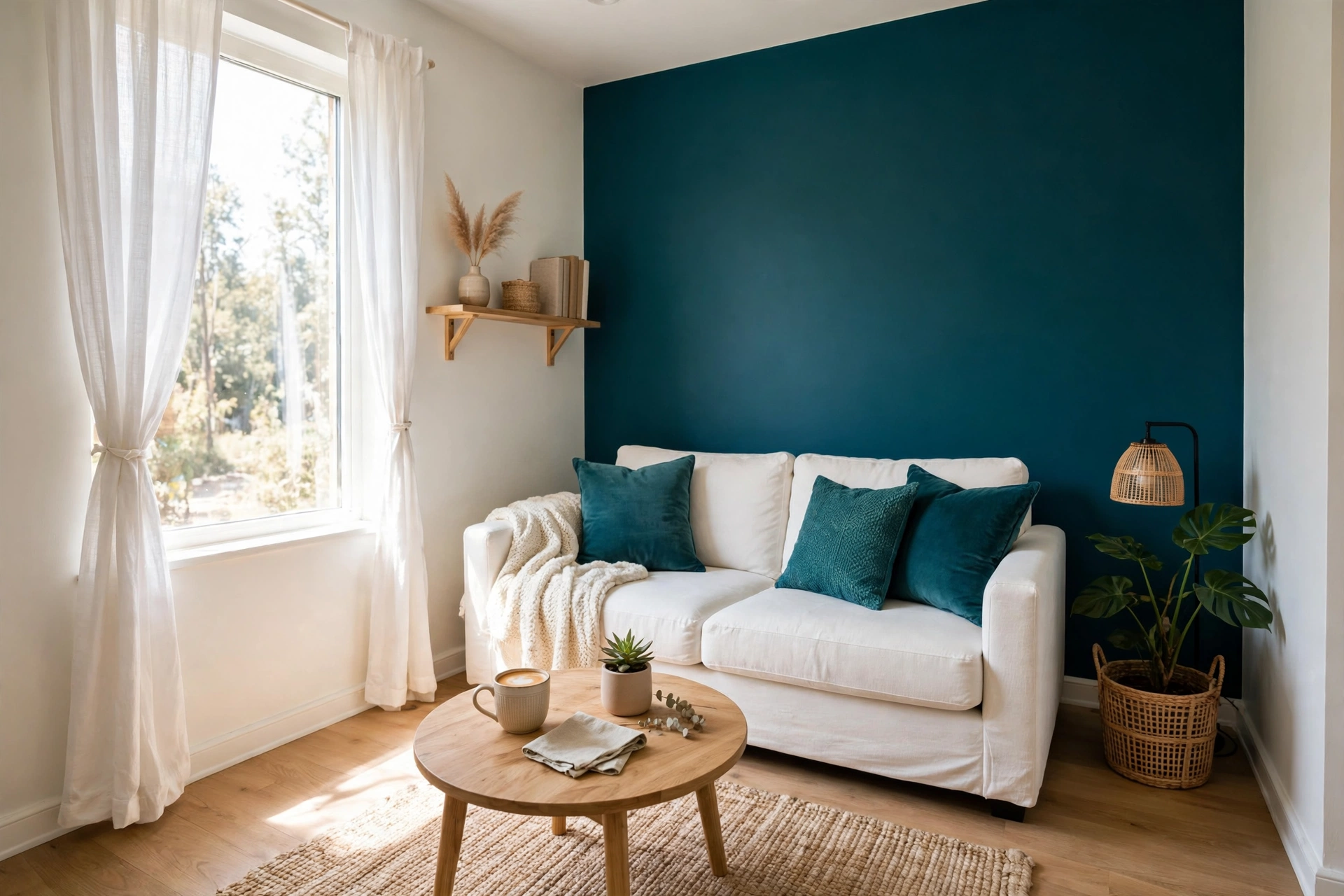
Warm white plus deep teal. Best for living rooms and home offices that need calm with character. Main advantage: teal recedes like a cool color but still feels designed, not clinical. Watch out for: teal going too dark on a wall that gets no direct light, so keep it to one wall. Verdict: strong, but only as an accent, never as a four wall color in a small room.
Pale sage plus warm white. Best for bathrooms, bedrooms, and offices that need a quiet, natural feel. Main advantage: sage reflects plenty of light while adding more personality than plain white. Watch out for: sage reading gray or mint depending on the lamp, so check it under your actual bulbs. Verdict: excellent for a calm room, weak for a room that needs energy.
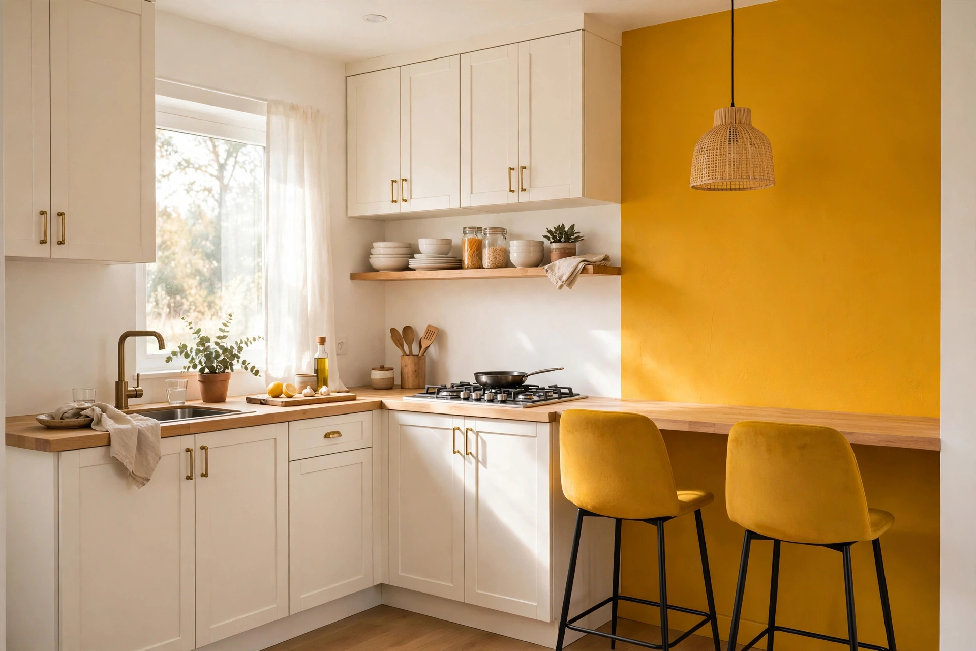
Greige plus mustard. Best for living rooms and kitchens with warm wood floors. Main advantage: greige bridges warm and cool finishes, and mustard adds warmth in a small dose. Watch out for: mustard taking over if it spreads past one element, so keep it to stools, cushions, or one wall. Verdict: the most flexible palette for an open plan, as long as the mustard stays in its 25 percent lane.
Paint math and a sample order
Work from wall area, not from room size alone. Measure each wall, multiply length by height, add the walls together, then subtract doors and windows. A standard interior door is about 21 sq ft (2 sq m) and a standard window is about 15 sq ft (1.4 sq m). Divide the net wall area by the coverage on your paint can, and round up, not down. Two coats are the norm for a color change, so double the one coat figure before you order.
For the 10 by 12 foot room in the intro, the order in this small room color guide is two gallons of the wall color for two coats, plus one quart of trim paint if you are repainting trim, and one gallon of ceiling paint only if the ceiling is changing too. That sample order is a starting point, not a quote. Check the coverage printed on your own can, because coverage varies by brand and by surface, and a patched or porous wall drinks more paint than a smooth one.
One last cost control: sample pots are cheap and repaints are not. Two large swatches on two walls cost far less than a full room in the wrong shade, and they are the only test that uses your actual light, your actual trim, and your actual floor. Every other test is a guess.
Conclusion
Color in a small room is a system, not a single decision. Light direction picks the temperature, fixed finishes narrow the shade, one light dominant plus one bold accent sets the palette, and the ceiling, trim, and finish carry it through. Start with the light audit, sample on two walls, and use this small room color guide as the map to go deep on whichever decision is next for your room, including seasonal color through small space christmas decorating ideas. A small room does not need more color. It needs the right color, in the right place, for the light it actually gets.
What color makes a small room look bigger?
Light, low contrast colors make a small room look bigger, because they reflect more light and soften the edges where walls meet. Soft whites, pale greige, pale blue, and muted sage all work, as long as the undertone suits the room’s light. The single biggest win is not one magic shade. It is low contrast between walls, trim, and ceiling, so the eye travels without stopping.
Should small rooms be all white?
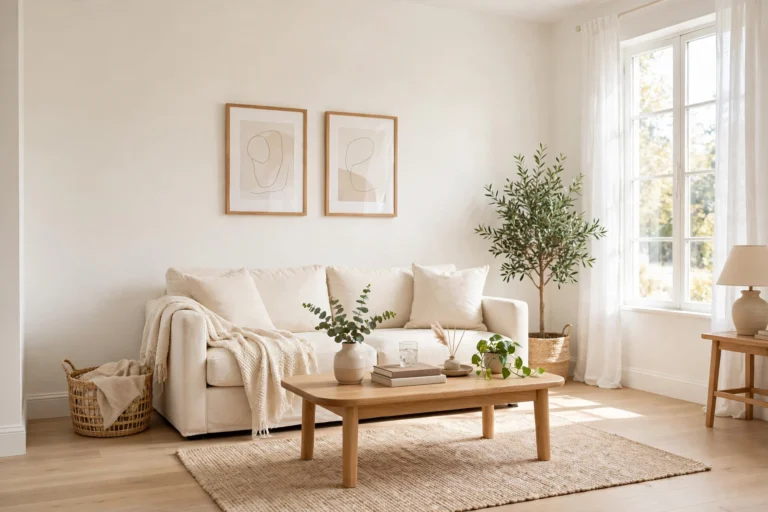
No, small rooms do not have to be all white, and pure white can look flat and cold in a room with limited natural light. A warm white, a pale greige, or a soft sage gives the same open effect with more character. What matters is lightness and low contrast, not whiteness itself. If you love white, pick a warm white for a north facing room and a cooler white for a sunny south facing room.
Warm or cool paint for a north facing room?
Pick warm or neutral paint for a north facing room, because north light is already cool and indirect. Warm whites, warm greige, and soft warm neutrals balance that light instead of doubling it. Avoid icy grays and stark cool whites unless you add warm lamps, warm wood, and warm textiles to balance them. Our north facing post covers this in full, with shades that survive cold light.
How many colors should a small home have?
Keep a small home to three to five wall colors in total, with separate colors for trim and ceilings. Repeat colors where rooms share a sightline, and give each wall color a job: one base that connects spaces, supporting shades for individual rooms, and one deeper accent for an enclosed room. More than five wall colors in a small home usually looks scattered, even if each shade is good on its own.