7 Best Paint Colors for North-Facing Rooms (That Kill the Cold, Gray Light)
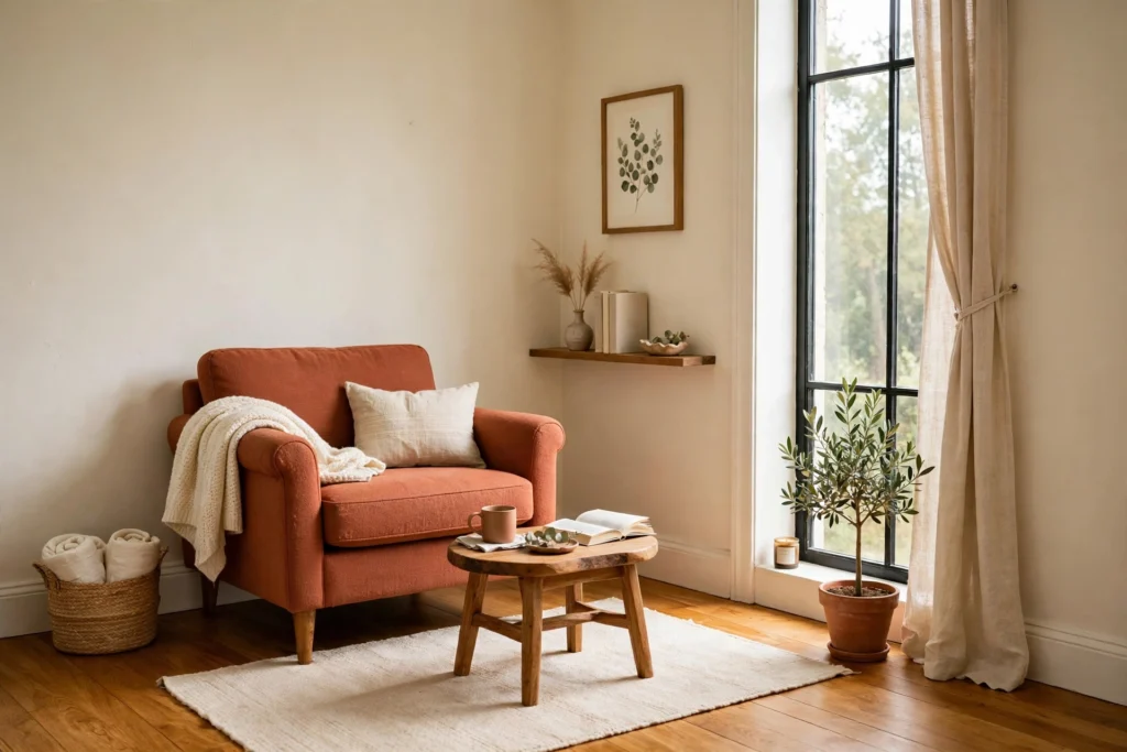
You picked a warm cream. The swatch was perfect. Then you painted a whole north-facing wall and it dried to something that can only be described as “slightly sad dishwater.” I know this room. My own north-facing spare bedroom ate two paint colors before I figured out the rule: north-facing rooms don’t get warm sunlight — ever. They get cool, bluish-gray light all day, every day, and that light steals the warmth out of whatever you put on the walls.
The fix isn’t more paint coats. It’s picking colors that already contain the warmth the light takes away. These are the seven paint colors for north-facing rooms that actually work, plus the sampling trick that will save you from buying three wrong gallons.
First, understand what you’re fighting
North-facing light is consistent (no harsh sunbeams), flat, and cool — it carries a blue-gray cast. Anything with cool undertones (blues, cool grays, stark whites) will look colder, flatter, and sometimes faintly lavender or purple in this light. Whites will look gray. Grays will look like concrete.
So the first rule: choose colors with warm undertones. You don’t have to paint everything peach — warm just means the color’s underlying pigment leans yellow, red, or gold rather than blue or purple. That warmth neutralizes the cold light and the room reads balanced instead of chilly. If you’re still learning how paint behaves in tight rooms, start with our guide to the right paint color for a small room, then come back for these north-light specifics.
The 7 colors that beat north light
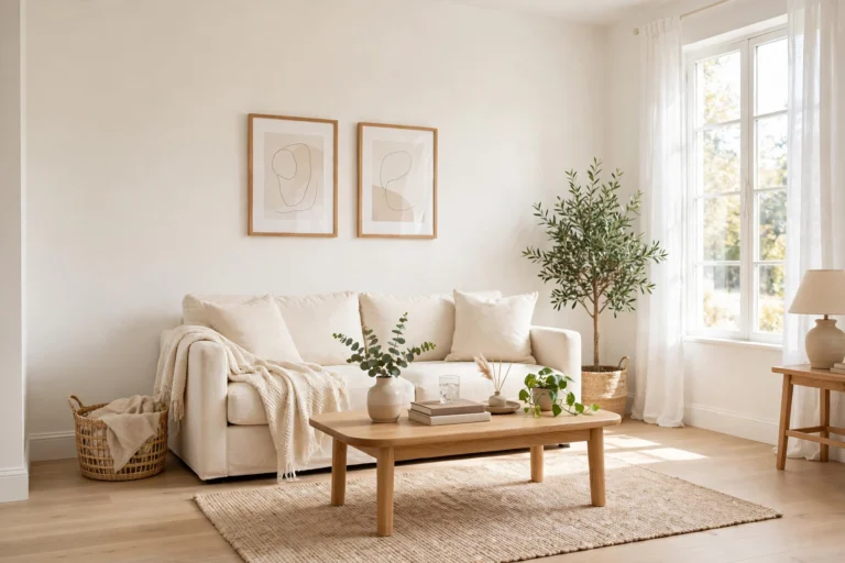
1. Warm ivory with a yellow undertone
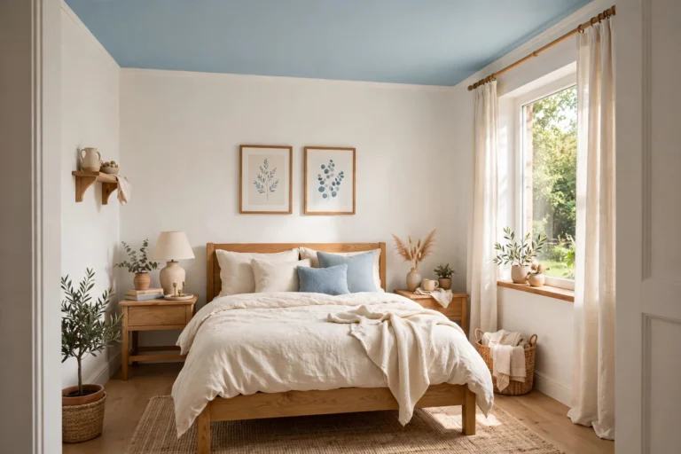
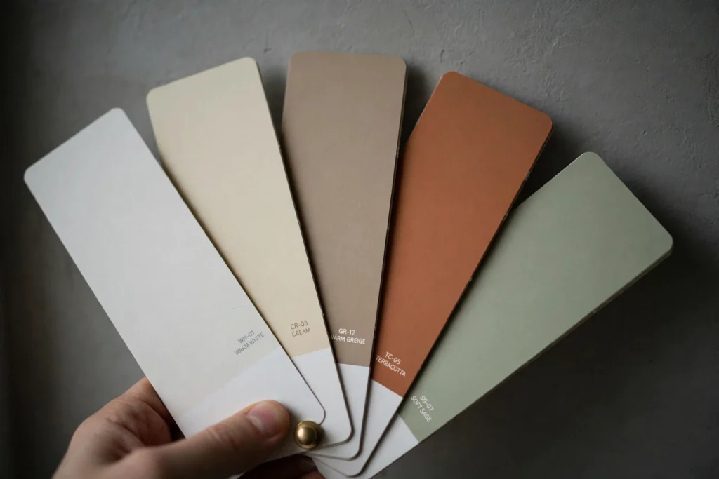
The safest starting point for a small north-facing room. A true warm ivory (think buttered-toast white, not clinical white) holds its glow even when the light turns gray at 3 p.m. Look for whites with “warm” in the name and yellow — not pink or blue — in the undertone. In a 10 × 12 ft (3 × 3.7 m) bedroom it bounces enough light to keep the room feeling airy without going gray. Keep the ceiling the same color — a bright white ceiling next to warm walls will only exaggerate the gray cast.
2. Warm greige
Greige (gray + beige) is the diplomatic answer when you want a neutral that isn’t white. In north-facing rooms, choose a greige that sits clearly on the beige side — roughly 60% beige, 40% gray. Test it on a wall that faces the window and one that doesn’t; in this light the color can shift noticeably between the two. This is one of the few neutrals that survives a gray January day looking intentional rather than gloomy.
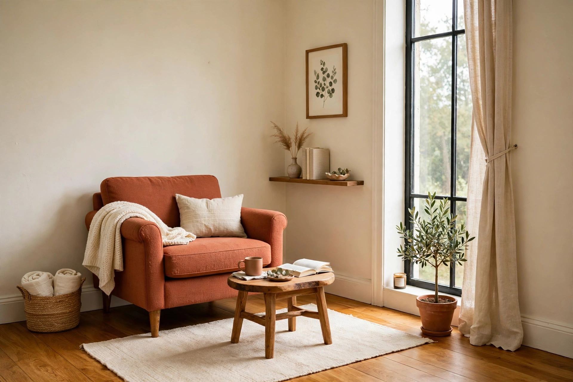
3. Soft terracotta / clay
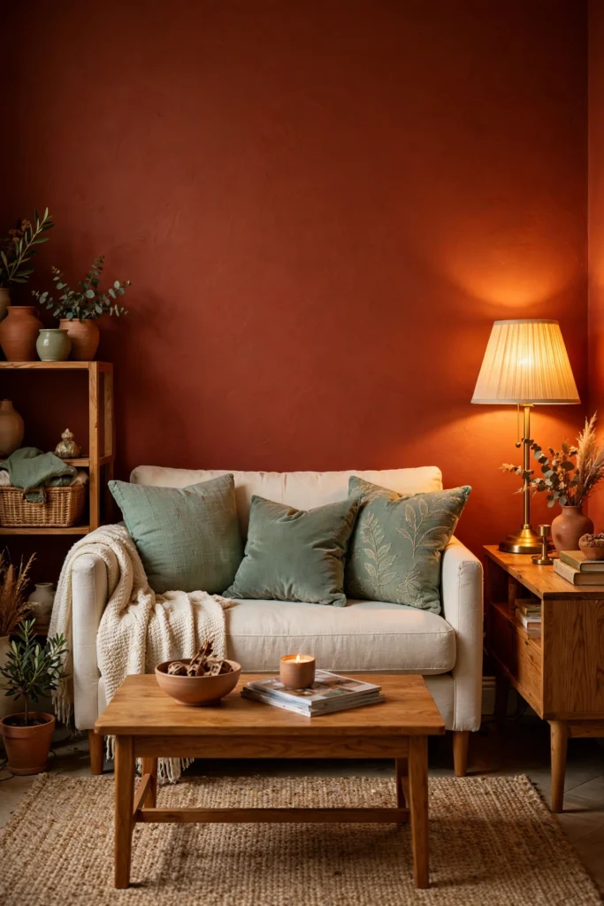
If your north-facing room feels lifeless, this is the one. A muted clay or soft terracotta brings its own warmth to the party, so it doesn’t depend on sunlight to look alive. It also pairs beautifully with this year’s warm color trends if you want a color that feels current without chasing a fad. Use it as an accent wall behind a bed or sofa, and keep the other three walls a warm ivory so the room doesn’t shrink.
4. Buttery warm yellow
Not school-bus yellow — think the color of warm honey or a wheat field. Soft warm yellows are the single best paint for rooms that get almost no direct sun, because they simulate the sunlight that isn’t there. They work especially well in north-facing kitchens and breakfast corners, and they’re forgiving on older walls since their warmth hides small imperfections. Pair with cream trim, not stark white trim, or the contrast will read as dirty.
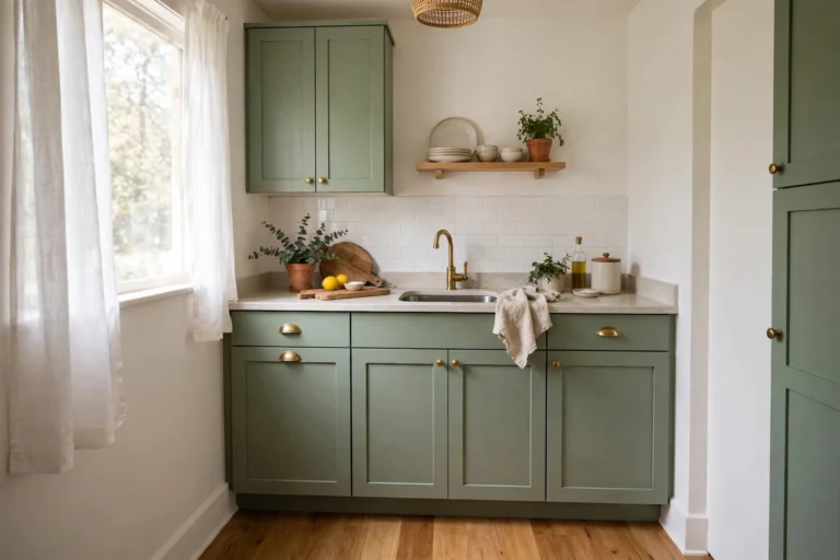
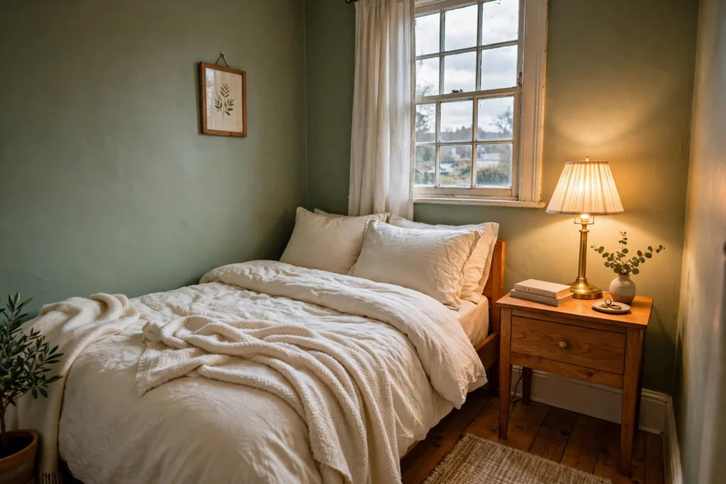
5. Warm sage green
Greens are tricky in north light — anything with a blue undertone turns cold and murky. A warm sage (one that reads olive or herbal rather than mint) is the exception, and it’s one of the most forgiving colors for small bedrooms and home offices. It sits calmly in gray light, goes beautifully with honey-oak furniture, and stays sophisticated when the sun never shows up. Avoid sage colors with gray undertones; in north light they go straight to khaki-gray.
6. Warm blush / peachy pink
A soft peachy blush is basically a cheat code for north-facing bathrooms and small dressing areas. The pink undertone glows warmly under cool light, and it flatters skin tones in bathroom mirrors — a real, practical win. Keep it dusty and muted (peach, not bubblegum), and if you’re decorating around it, warm fabrics help; the same rule applies when pairing curtains with warm walls, where warm linens beat cool whites every time.
7. The bold move: lean into the dark
Counterintuitive, but hear me out. If a north-facing room is small and gets almost no sun, fighting the darkness with pale colors can look washed out. Painting it a rich, warm dark — chocolate brown, deep warm charcoal, moody olive — turns it into a deliberate cozy space: a reading nook, a snug bedroom, a tiny home office that feels like a study. Dark warm colors need warm-toned bulbs (more on that below) and lighter textiles to balance, but the result is a room with actual character. This same “commit to the mood” logic is why warm cabinet colors work so well in kitchens that face north — the room stops pretending to be sunny and starts being itself.

Sample like a professional (48 hours, big swatches)
This is where most people lose money. A 2-inch (5 cm) swatch lies. Paint two large test patches — at least 24 × 24 in (60 × 60 cm) each — on the wall that gets the most light and the wall that gets the least. Live with them for 48 hours and check them at morning, midday, and evening with the lights you actually use. If you can, test a second color right next to the first so you can compare directly. Two sample pots cost less than one gallon of the wrong color.
Sheen and lighting matter as much as the color
- Use eggshell or satin, not flat. North-facing rooms need every bit of light reflection they can get, and a slight sheen bounces light around the room. Flat paint absorbs it and goes dead.
- Swap cool bulbs for 2700K warm white. You can repaint perfectly and still hate the room if it’s lit with daylight (5000K) bulbs. Warm bulbs add back the yellow the northern sky takes away. This one change is often bigger than the paint itself.
- Don’t forget the trim and doors. Creamy off-white trim ties warm walls together; bright white trim against warm walls will look like a different paint entirely in cool light.
Colors to avoid in north-facing rooms
Cool grays (they go blue or lavender), stark whites (they go gray), icy blues (they amplify the cold), and anything described as “crisp,” “fresh,” or “arctic” — those adjectives are all doing the same work: they assume warm sunlight that you don’t have. If you already painted a room in one of these and it looks off, you don’t necessarily need to start over — a warm ivory on one accent wall plus warm lighting can often rescue a too-cool room.
Why do my walls look gray in my north-facing room even though I painted them beige?
Because north-facing light carries a blue-gray cast that neutralizes warm undertones. A beige that looks warm in the store can read flat gray at home. Choose colors with stronger warm undertones (yellow, red, or gold based) and test large swatches in the room for 48 hours before committing.
Is white paint bad for north-facing rooms?
Stark, cool whites turn gray or faintly blue in north light. Warm whites with a yellow or creamy undertone work much better — they keep their glow all day. If you want white walls, skip the “pure white” cans and go for warm ivory instead.
What’s the best paint finish for a north-facing room?
Eggshell or satin. These slight sheens reflect light around the room instead of absorbing it, which helps compensate for the lack of direct sun. Flat finishes look dead in cool northern light, while high-gloss can feel harsh on large walls.
Can I use dark colors in a small north-facing room?
Yes — and sometimes they’re better than pale ones. Rich warm darks (chocolate, warm charcoal, deep olive) turn a dim north-facing room into an intentional cozy space instead of a failed bright one. Just pair them with warm 2700K lighting and lighter textiles for balance.