Sherwin-Williams Sea Salt SW 6204: LRV, Undertones and Is It Blue or Green?
The Short Answer
Sherwin Williams Sea Salt SW 6204 is a soft green-gray paint color with an LRV of 63, and the short answer to the question everyone asks is that it is green first and blue second. In warm daylight it reads as a muted sage green. In cool north light it flashes pale blue. My verdict: it is one of the best colors for a small bathroom or a calm bedroom, but only if you test it in your own light first, because the room decides which color you get. That light test is the one thing most reviews rush past, and this guide covers it in full.
At a Glance: Sherwin-Williams Sea Salt SW 6204
| Spec | Detail |
|---|---|
| Color code | SW 6204 |
| LRV | 63 (Sherwin-Williams published; Shop Spruce lists the precise figure as 63.2) |
| Hex | #CDD2CA |
| RGB | 205, 210, 202 |
| Color family | Green, with blue undertones |
| Undertone | Green-gray with a soft blue undertone |
| Best uses | Bathrooms, bedrooms, laundry rooms, coastal living spaces |
| Finishes | Eggshell or satin for walls, semi-gloss for cabinets and trim |
| Status | SW Top 50 color |
Sherwin-Williams publishes the LRV as 63, and nearly every review agrees on 63. Two pages still carry a different number, and both are wrong. The Color Concierge lists Sea Salt at 64, and colorandtone lists an estimated 64.9. Both pages were opened for this guide on 2026-11-14, and both still show those figures. The 64.9 is a hex-derived estimate, not a measured figure, and the page itself admits the published number is the one to trust. If a page tells you 64 or 64.9, it is not using the manufacturer’s published figure.
What Is the LRV of Sea Salt?
The LRV of Sherwin Williams Sea Salt SW 6204 is 63. On the 0 to 100 scale, 0 is absolute black and 100 is pure white, so 63 sits in the light range without tipping into near-white. A wall painted in Sea Salt reflects about 63 percent of the light that hits it and absorbs about 37 percent.
That number is the whole story for small rooms. Against a mid-tone wall at LRV 50, Sea Salt reflects about 1.3 times as much light, so the same room with the same window looks clearly brighter. Against Alabaster at LRV 82, Sea Salt reflects only about three quarters as much light, which is why Alabaster trim reads as a clear step lighter beside it. Against Rainwashed at LRV 59, the gap is only 4 points, and on a full wall you will barely see it. What you will see is the color, and that is where the two part ways. For scale, Comfort Gray at LRV 54 is the next shade down on the same color strip, and it reads clearly deeper and moodier.
Sea Salt Undertones: Green, Gray, and a Blue Flash
Sea Salt has a green-gray undertone with a soft blue flash. On a wall, that means it reads as a muted sage green most of the day, never as a bright green, and the gray is what keeps it from looking minty. Sherwin-Williams files it in the green family, and that is the right call. Green leads. Blue follows. Gray softens both.
The gray does as much work as the green. Without it, a color at this lightness with this much green would read as seafoam or mint. The muting lets it sit beside white trim and natural materials without announcing itself, while the blue flash supplies the coastal feeling that made the color famous. That is a different mechanism from a warm greige, which is why Sea Salt should not be judged against beiges at all. Put it beside Accessible Beige and you are choosing between two temperatures, not two depths of the same color.
One warning about the swatch. The chip makes Sea Salt look almost gray, and the wall makes it look greener. So sample it properly. Paint a swatch at least 2 ft by 2 ft (60 by 60 cm) on the actual wall, live with it for two days, and check it morning, noon, and night. A peel-and-stick sample costs $3.95 from Sherwin-Williams, and a Color to Go quart costs $9.59. Do not judge this color from a phone screen, and do not judge it from a tiny chip in the store.
Is Sea Salt Blue or Green?
Sea Salt is green, but the light gets a vote, and in some rooms the light wins. In warm south or west light, it reads as a soft sage green. In cool north light, it flashes pale blue. In dim rooms with cool bulbs, it can read as a plain gray-blue. The answer is not one word. It is one word plus a direction.
In a south-facing room, Sea Salt leans green and looks most like the soft sage people picture from photos. Warm sunlight pushes the green forward while the gray calms it, so the wall reads as a muted mineral green-gray rather than a distinct color. In a west-facing room, afternoon sun warms it further, and it can look greener late in the day. In an east-facing room, it reads green in the morning and cools toward gray by the afternoon.
In a north-facing room, Sea Salt tips blue, and that is the condition to plan around. Cool, indirect light amplifies the blue-green flash, and reviewers regularly describe the color reading as pale blue on overcast days. Some people want exactly that, and in a north-east bedroom used mostly in daylight it can feel atmospheric. But anyone expecting sage will be disappointed. To hold it nearer its green-gray center in a north-facing room, use 2700K warm bulbs and bring in warm timber and natural textiles. Our guide to the best paint colors for north-facing rooms covers the same light problem across seven colors, and Sea Salt is the color that proves the rule most clearly.
Bulb temperature shifts Sea Salt as much as orientation does. At 2700K it tips toward a soft sage. At 4000K and above it reads cooler and bluer, and in a room that already lacks warm daylight the two effects compound. I would use 2700K, and 3000K at the most, for any room painted Sea Salt. Dimmable warm fittings in a bedroom or bathroom let the color move gently through the evening instead of flattening under a single hard light.
Best for: South and west-facing rooms where you want the sage green to show. Main advantage: It changes through the day in a way that feels alive rather than flat. Watch out for: North-facing rooms and 4000K bulbs, where it turns pale blue. Verdict: If your room faces north and you want sage, pick something else or warm the room up first. If your room gets warm light, Sea Salt is the sage you pictured.
Sea Salt vs Rainwashed: Siblings, Not Twins
This is the comparison most people search for, and it drives a large share of the searches for this color. The answer is simple once you see the numbers side by side, but the numbers are not the whole answer. The blue decides.
| Sea Salt SW 6204 | Rainwashed SW 6211 | |
|---|---|---|
| LRV | 63 (63.2) | 59 |
| Hex | #CDD2CA | #C2CDC5 |
| What it is | Soft gray-green, muted | Soft blue-green, a little deeper |
| Undertone | Green-gray with a blue flash | Blue-green with a gray base |
| In bright light | Reads greener and airier | Reads bluer and more colorful |
| In dim light | Stays airy, can drift gray | Gets darker, holds its color |
| Best for | Bedrooms, bathrooms, whole-room neutral | Statement walls, kitchens, baths that need color |
The LRV gap is 4 points, 63 against 59, and on a full wall that gap is small but visible. Rainwashed reads noticeably more saturated and more blue, while Sea Salt is the lighter, greener, more muted cousin. Color-match databases put the pair at Delta E 3.0, which means close enough to confuse on a chip and far enough apart to see side by side on a wall. They are siblings, not twins.
Best for: Sea Salt, if you want a barely-there tint that acts like a neutral across a whole room. Rainwashed, if you want the aqua to actually show and you are ready to commit to color. Main advantage: Sea Salt gives you more light bounce and more forgiveness, since it is lighter and quieter. Rainwashed gives you more presence, since it holds its color in dim light where Sea Salt can drift gray. Watch out for: Rainwashed in a north-facing room, where it goes bluer still. Sea Salt next to cream or yellow finishes, where it can look washed out. Verdict: Pick Sea Salt if you want calm and you want the room to feel bigger. Pick Rainwashed if you want color and you have the light to carry it.
Sea Salt vs Comfort Gray: The Shorter Comparison
Comfort Gray SW 6205 is the next shade down on the same Sherwin-Williams color strip, with an LRV of 54. It is substantially darker, bluer, and more muted than Sea Salt, and it reads as a real color where Sea Salt reads as a tinted neutral. In a bright south-facing room, Comfort Gray can feel rich and grounded. In a dim room, it can feel heavy in a way Sea Salt never does.
The rule is simple. If Sea Salt feels too pale or too quiet for you, Comfort Gray is the next step down the same strip. If Comfort Gray feels too dark, Sea Salt is the step back up. Comfort Gray also makes a good island or vanity color beside Sea Salt walls, since the two share the same family and the depth contrast looks intentional.
Where Sea Salt Works: Room by Room
Sea Salt in Bedrooms
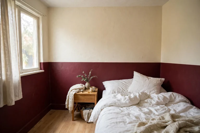
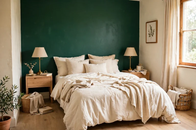
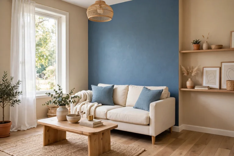
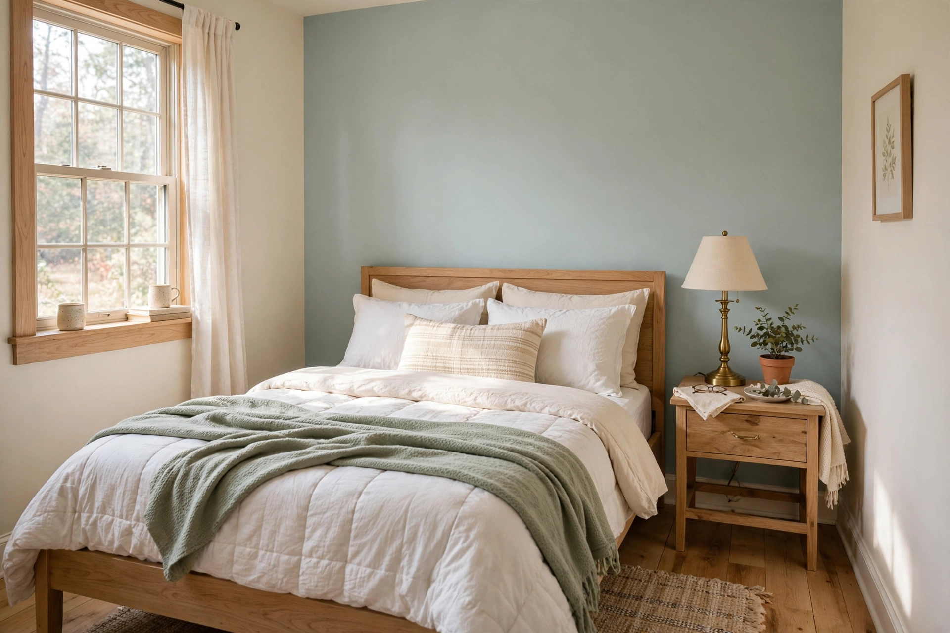
In a bedroom, Sea Salt works on all four walls. It is calm enough to feel restful at night and bright enough to feel fresh in the morning. In a south-facing bedroom it is a particularly strong pick, because the warm light pulls the green forward. Pair it with linen bedding, warm wood furniture, and 2700K bedside lamps, and the room feels calm rather than cold.
Best for: All four walls in a bedroom, especially a south-facing one. Verdict: The best whole-room use of this color, and the one most reviews agree on.
Sea Salt in Bathrooms
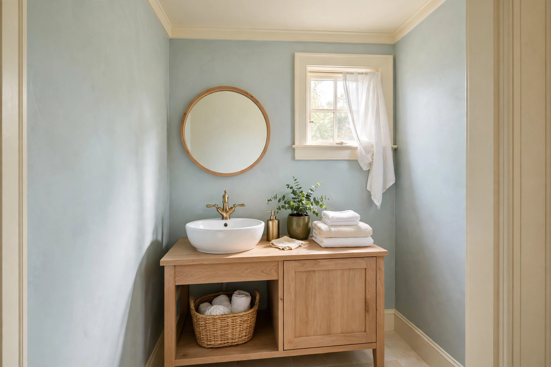
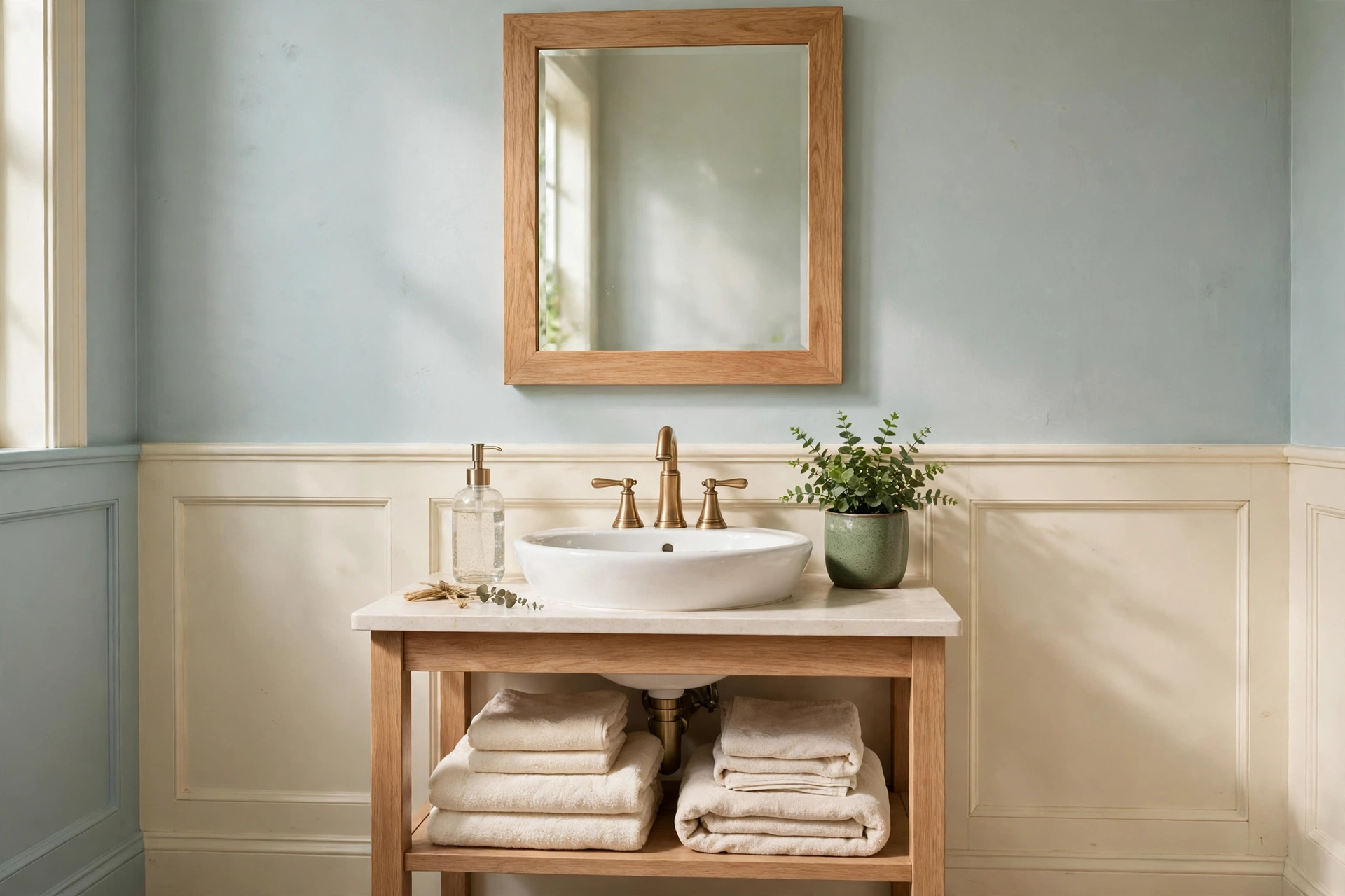
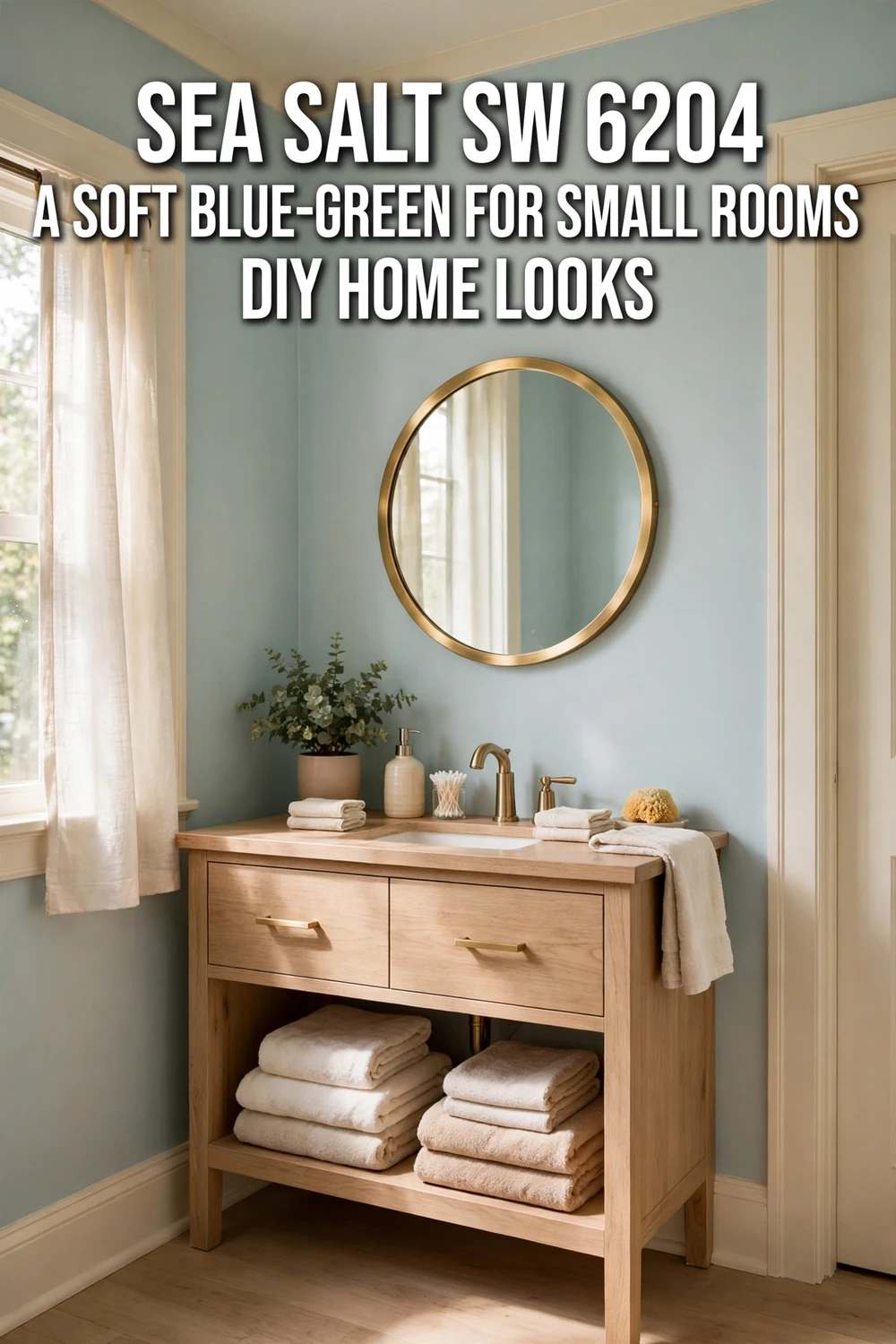
Bathrooms are where Sea Salt is most at home, and the spa association is earned by how the color behaves in a small, bright, reflective room. Daylight lifts it, tile and mirrors bounce it around, and the gray stops the green from becoming sweet. Use it with white tile, brushed nickel or brass fixtures, and warm 2700K lighting. A windowless bathroom is the exception, where the lack of daylight tends to push it cooler and bluer, so test a large sample there first.
Best for: Small bathrooms with a window, white tile, and warm fixtures. Verdict: The classic Sea Salt room, and the reason the color stays in the Top 50.
Sea Salt in Laundry Rooms
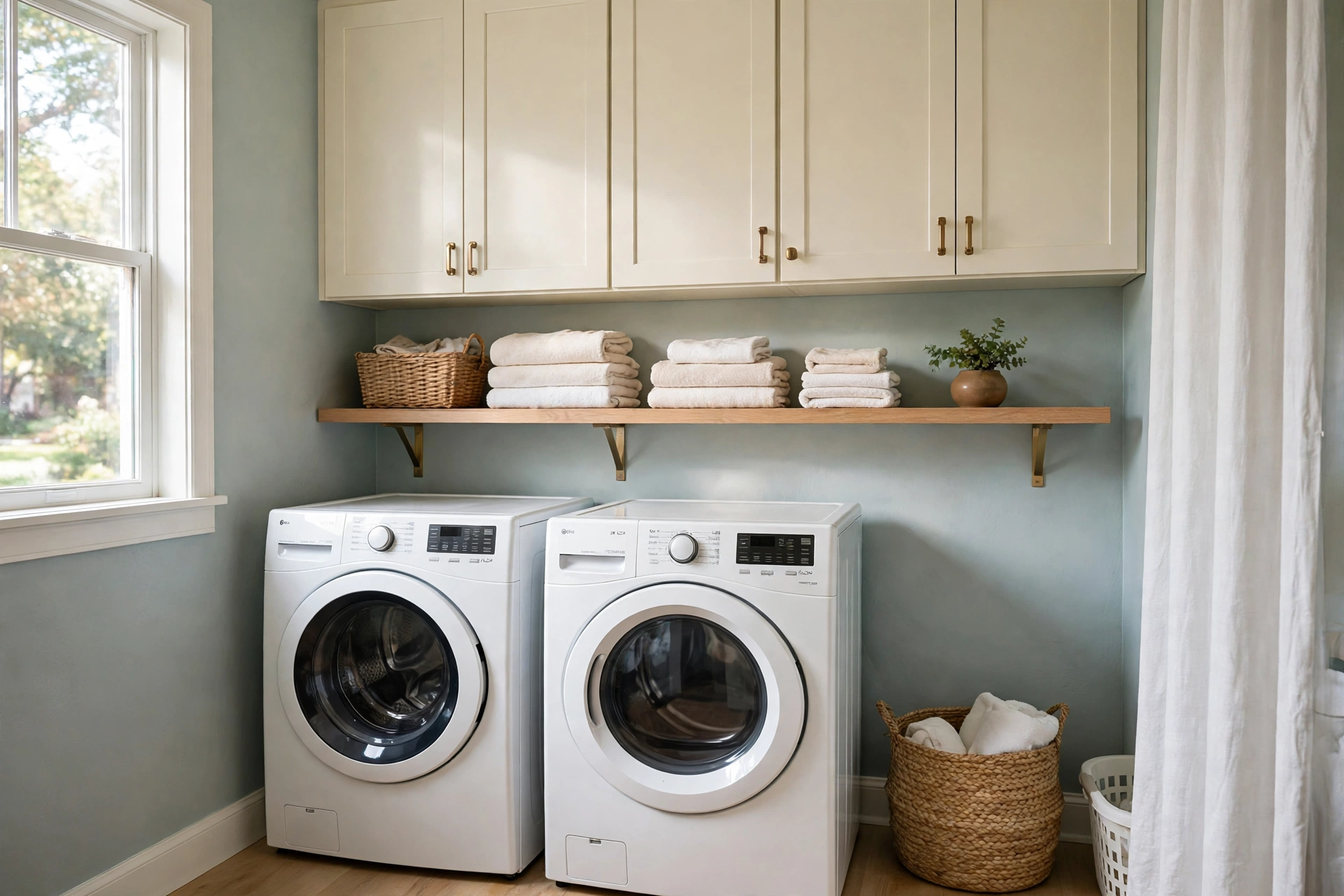
Sea Salt suits laundry rooms because they are small, practical, and usually need to feel clean. The LRV keeps a compact room open, and the cool undertone reads as fresh next to white appliances and white shelving. The risk is the same as in a windowless bathroom: with only artificial light the color can slide toward blue, so use warm-spectrum bulbs and a warmer white for the shelving or worktop to keep it balanced.
Best for: Laundry rooms and mudrooms that need a lift. Verdict: A strong small-room pick, and the best place to try Sea Salt on cabinets.
Sea Salt in Living Rooms and Coastal Spaces
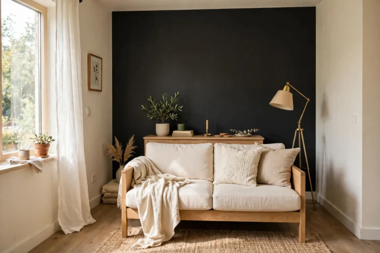
Living rooms need Sea Salt to be balanced with warm furnishings or the room can drift toward cool and slightly impersonal. It works best with natural fibers, timber furniture, and a sofa in oatmeal or warm white rather than gray. In a south or west-facing room with those elements, the wall reads as a soft backdrop that lets the furniture lead. Do not overload the room with beach decor. Sea Salt already gives subtle coastal energy on its own, and anchors and seashells on top of it turn a calm color into a theme.
Best for: Coastal and transitional living rooms with warm wood and natural textures. Verdict: A good backdrop color, not a statement color, and it needs warm partners.
Sea Salt on Exteriors
Sea Salt can work outside, but treat it with more caution outdoors than in. Strong sun makes it look lighter on the house than on the chip, and it can read pale or washed out on a full facade. It works better as a front porch ceiling color, on shutters, or on a front door than on all the siding. Sherwin-Williams rates it for exterior use, but test a large sample board outside first, in both sun and shade, before you commit.
Best for: Porch ceilings, shutters, and front doors. Verdict: A gentle exterior accent, not a first-choice whole-house exterior color.
Where Does Sherwin Williams Sea Salt SW 6204 Work Best in a Small Room?
Sherwin Williams Sea Salt SW 6204 works best in a small room on all four walls of a small bathroom, with the ceiling painted in a clean white. That is the whole-room verdict, and the math backs it up.
A small bathroom, say 5 ft by 8 ft (1.5 by 2.4 m), has about 208 sq ft (19.3 sq m) of wall. With an LRV of 63, Sea Salt walls reflect about 63 percent of the light that hits them, against only half the light for a mid-tone wall at LRV 50. That is about 1.3 times as much light, so the same window lights the room far better, and the mirrors and tile bounce that light around again. Against a white wall at LRV 84, Sea Salt gives up some brightness, but it gives back real color, which is the trade most small bathrooms want.
The exception is a small room with almost no light and cool bulbs. There, Sea Salt can drift toward gray-blue, and a lighter color is the safer pick. Everywhere else, paint all four walls and keep the floor light. Our guide to the best paint colors for small living rooms explains the same rule across seven colors, and Sea Salt is the cool green-gray case that proves it.
Sea Salt on Cabinets: The Honest Verdict
This is the section where the top pages disagree, so here is the honest position. Kylie M Interiors, the most authoritative reviewer in this niche, says Sea Salt is generally not a good cabinet color. A cabinet seller, thewcsupply, says it is popular for cabinetry. Both are partly right, because they are talking about different jobs.
A full kitchen run of Sea Salt cabinets is a risk. The color shifts with light, and a kitchen has mixed light all day, so the cabinets can read green in the morning and blue-gray by evening. The contrast against countertops and hardware amplifies every undertone shift, and a full run that shifts is hard to live with. That is why the honest verdict for full kitchen cabinets is generally no.
A small run is a different story. A laundry room cabinet run, a bathroom vanity, or a kitchen island in Sea Salt works well, because the color is contained and the white uppers or white walls around it keep it calm. Home With Marianna calls laundry cabinets one of the best uses of this color, and that matches the logic. Small dose, big charm. If you are renting, skip painting the cabinets entirely. Painting landlord cabinets is a 1 out of 5 on renter-friendliness, with a 5 out of 5 deposit risk, so check your lease first.
Best for: Laundry cabinets, bathroom vanities, and kitchen islands with white uppers. Main advantage: Soft color without the commitment of a bold green. Watch out for: Full kitchen runs in mixed light, where the blue flash shows. Verdict: Yes for a small run, generally no for a full kitchen. Test it against your actual countertop before you commit.
Coordinating Colors That Go With Sea Salt
Sea Salt needs clean whites and warm wood, not creamy whites. A warm white trim next to Sea Salt makes the wall look cooler and bluer by contrast, so keep the partners clean or warm-neutral, never yellow.
| Color | Code | LRV | Role |
|---|---|---|---|
| Pure White | SW 7005 | 84 | Trim and ceilings, the crisp partner |
| Extra White | SW 7006 | 86 | Trim and ceilings, the brightest partner |
| Spare White | SW 6203 | 77 | SW coordinating color, soft white for ceilings or trim |
| Fleur de Sel | SW 7666 | 72 | SW coordinating color, light cool gray for adjoining rooms |
| Summit Gray | SW 7669 | 30 | SW coordinating color, deep gray for contrast on cabinets, accent walls, or doors |
| Rainwashed | SW 6211 | 59 | Walls next to Sea Salt, the bluer sibling |
| Silver Strand | SW 7057 | 59 | Walls next to Sea Salt, the even gray-green blend |
| Creamy | SW 7012 | 81 | Warm neutral for adjoining rooms, use sparingly beside Sea Salt |
| Naval | SW 6244 | 4 | Accent, front door, or island for coastal contrast |
| Iron Ore | SW 7069 | 6 | Accent, doors, or hardware contrast |
For trim, Pure White is the safe pick, and Extra White is the brighter one. For walls next to Sea Salt, Rainwashed at LRV 59 is the bluer sibling and Silver Strand at LRV 59 is the grayer blend, and both sit close enough to flow without clashing. For the accent, Naval at LRV 4 is the deep navy that makes Sea Salt look more coastal by contrast. A warm white trim is the one partner to avoid, since creamy trim makes this cool color look muddy.
Our full Greek Villa profile shows the opposite end of the temperature scale, a warm white that needs the same kind of trim care for the opposite reason, and the two profiles together cover the warm and cool sides of a whole-house palette.
What Sea Salt Costs: Prices and Paint Math, as of November 2026
Sea Salt costs the same as any other Sherwin-Williams color in the same paint line. You are paying for the paint, not the color, so the only question is which line you buy and how much of it you need.
| Item | Price, as of November 2026 |
|---|---|
| Emerald Interior, per gallon | $101.49 to $106.49 |
| Duration Home, per gallon | $95.99 to $100.99 |
| Cashmere, per gallon | $83.49 to $88.49 |
| Color to Go sample, quart | $9.59 |
| Peel-and-stick sample, 8 by 8 in | $3.95 |
| Gray-tinted primer, per gallon | about $30 to $40 |
Prices are list prices from Sherwin-Williams stores, checked in November 2026. The Emerald, Duration Home, and Cashmere ranges were re-verified against October 2026 list prices this month, and the sample prices were checked against the Sherwin-Williams site itself. One correction: the Color to Go quart is $9.59, not the $11.29 figure carried in earlier posts in this series. Sherwin-Williams runs 30 to 40 percent off sales every four to six weeks, so the price you actually pay is often well below list.
Coverage is 350 to 400 sq ft per gallon per coat (32.5 to 37.2 sq m). A 10 ft by 10 ft room (3 by 3 m) with an 8 ft (244 cm) ceiling has about 320 sq ft (29.7 sq m) of wall, so buy 2 gallons for two coats. A 12 ft by 14 ft room (3.7 by 4.3 m) has about 416 sq ft (38.6 sq m) of wall, so buy 2 gallons plus 1 quart for two coats and touch-ups. A small 5 ft by 8 ft bathroom (1.5 by 2.4 m) has about 208 sq ft (19.3 sq m) of wall, so buy 1 gallon plus 1 quart for two coats.
Project totals for 2 gallons: Emerald $202.98 to $212.98, Duration Home $191.98 to $201.98, Cashmere $166.98 to $176.98. Small bathroom totals for 1 gallon plus 1 quart: Emerald about $127 to $133, Cashmere about $104 to $111. Sea Salt usually needs no tinted primer over light walls, so skip the primer unless the wall underneath is dark. Over a dark wall, add one gallon of primer at about $30 to $40, in a light gray tint rather than white, so the primer does not flash through the first coat. A single accent wall, about 80 sq ft (7.4 sq m), needs one gallon for two coats, so budget $83 to $107 for the paint. Time estimate: a small bathroom takes one day including prep, and a small room takes a full weekend.
Mistakes to Avoid With Sea Salt
Skipping the sample. Sea Salt changes more with light than most colors. A $3.95 peel-and-stick sample or a $9.59 quart saves you from repainting a whole room. Using it in a dark north-facing room and expecting sage. North light turns it blue, and no bulb fully fixes a room with no warm daylight. Pairing it with creamy warm whites. Creamy trim makes Sea Salt look muddy and cold by contrast. Use Pure White or Extra White trim. Using 4000K bulbs. Cool daylight bulbs push it blue, and in a room that already lacks warm daylight the two effects compound. Use 2700K. Painting a whole house in it without testing every room. Sea Salt shifts from room to room, so a whole house in one color can feel inconsistent instead of cohesive. Test it in each room first. Using flat paint on cabinets or doors. Flat paint marks easily and it is hard to clean. Satin or semi-gloss is the right finish for anything hands touch. Skipping primer over a dark wall. Sea Salt is light, so it needs a primer coat over a dark color underneath, or the old color will show through. Over a light wall, primer is usually not needed.
What to Skip
Skip Sea Salt as a whole-house color if you want one fixed color that looks the same in every room. It is a chameleon, and a whole house in a chameleon color feels inconsistent. Use it in one or two intentional rooms instead. Skip Sea Salt on every wall of a room full of orange-toned oak floors, cherry cabinets, or heavy yellow-beige finishes. The cool gray-green undertones clash with red and orange woods, and the paint ends up looking muddy. Skip the cheapest paint line for cabinets, since cabinet paint needs hide and durability, and the budget lines need an extra coat that costs more than the saving. Skip matching Sea Salt with cool gray floors or cool gray furniture. Keep the partners warm, or the room will feel cold in a way that is hard to name. Skip a second blue-green on the wall next to it. Two blue-greens side by side look like a mistake, not a design choice, so use one blue-green and one clear contrast instead.
Renters: Read This Before You Paint Sea Salt
If you rent, check your lease before you open a can. Most leases allow painting only with written permission, and many require you to repaint back to the original color before you move out. Sea Salt is a light color, so repainting back over it is usually one coat of primer plus two coats of white, which costs about $83 to $107 in paint for a small room plus a weekend of work. Budget that repaint cost before you paint, not after. Keep the receipt and the paint code, and photograph the walls before and after, so a deposit dispute has a paper trail. One accent wall is reversible in an afternoon, and four walls in a color your landlord did not approve is a deposit risk. Painting walls you own is a 4 out of 5 on renter-friendliness, with a 1 out of 5 deposit risk when you have permission and repaint back. Painting without permission is a 1 out of 5, with a 5 out of 5 deposit risk.
Sources
- Sherwin-Williams, Sea Salt SW 6204 color page, LRV 63, hex #CDD2CA, RGB 205, 210, 202 (published color data, no direct link used)
- Sherwin-Williams, Color Tools page, Color to Go quart $9.59, peel-and-stick sample $3.95: https://www.sherwin-williams.com/homeowners/color-through-the-decades/color-tools
- Florida Homes and Living, “Sherwin-Williams Sea Salt Review: Undertones, LRV and Pairings,” LRV 63, SW coordinating colors, Florida light by direction: https://floridahomesandliving.com/sherwin-williams-sea-salt/
- By Design and Viz, “Sherwin-Williams Sea Salt, An Architect’s Verdict,” LRV about 63, light by direction, north-light blue shift: https://www.bydesignandviz.com/post/sherwin-williams-sea-salt
- Kylie M Interiors, “Sherwin Williams Sea Salt: Undertones, LRV, and Real-Home Results,” LRV 63, Sea Salt vs Rainwashed, cabinets verdict, updated 2026-11-02: https://www.kylieminteriors.ca/color-review-sherwin-williams-sea-salt-undertones-and-more/
- The Color Concierge, “Sherwin-Williams Sea Salt 6204 Color Review,” LRV listed as 64 (wrong, official is 63), blue-green undertones, Comfort Gray comparison: https://thecolorconcierge.com/sw-sea-salt-paint-color-review/
- Fine Homekeeping, “Honest Review of Sherwin-Williams Rainwashed 6211,” Rainwashed vs Sea Salt table, LRV 59 vs 63, hex #C2CDC5: https://finehomekeeping.com/sherwin-williams-rainwashed/
Sherwin-Williams is a trademark of The Sherwin-Williams Company. This site is not affiliated with or endorsed by Sherwin-Williams.
Frequently Asked Questions
Is Sea Salt blue or green?
Sea Salt is green first and blue second. Sherwin-Williams files it in the green family, and in warm daylight it reads as a soft sage green with a gray base. In cool north light or under 4000K bulbs, the blue undertone comes forward and it can read as a pale blue-gray. The room and the light decide which color you see, so test a large sample on your own wall before you commit.
What is the LRV of Sherwin Williams Sea Salt SW 6204?
The LRV of Sherwin Williams Sea Salt SW 6204 is 63. Sherwin-Williams publishes the figure as 63, and Shop Spruce lists the precise figure as 63.2. That means the color reflects about 63 percent of visible light and absorbs about 37 percent. That light range is why it brightens small bathrooms so well, and why it sits in the light range without tipping into near-white. Two pages still list 64 or an estimated 64.9, and both are wrong.
Is Sea Salt good for cabinets?
Generally no for a full kitchen run, and yes for a small run. A full run of Sea Salt cabinets shifts with the mixed light in a kitchen, so it can read green in the morning and blue-gray by evening. A laundry room cabinet run, a bathroom vanity, or a kitchen island works well, because the color is contained and white uppers or white walls keep it calm. Use satin or semi-gloss, and test it against your actual countertop first.
Does Sea Salt work in a north-facing room?
It can, but expect it to look cooler, grayer, and bluer than it does in a sunny room. North light amplifies the blue-green flash, and on overcast days it can read as a pale blue rather than a sage green. If you want sage in a north-facing room, warm the room up first with 2700K bulbs, warm timber, and natural textiles, and test a large sample on the north-facing wall before you commit.
How This Was Made
This guide was researched from live search results and review pages on 2026-11-14, and every price, LRV, and hex value was checked against at least one published source before writing.